this past week, i have created some goals for myself that would have seemed ridiculous last month. the reason i am okay with sharing them with you guys is that i am trying to learn that trying-and-failing is not the end of the world. and the other option is trying-and-succeeding, so i am about to take some risks & make some leaps in an effort to meet the latter!
it's hard to put dreams into words. and share them. because then you have to commit yourself to them. they can't just sink back into your imagination and go un-tried. so here goes:
my goal is to create a photography business that fully supports me by the end of the year.
still developing the details... i will share more verrry soon!
8.07.2009
8.06.2009
7.29.2009
cats in the jungle, cats in the city
 I just wanted to share this photo 'cause this neighborhood cat, Maxi, is a real cutie. She follows people for blocks and blocks and makes herself right at home with you. She can visit for hours or just for a minute. She had been laying in our living room for quite some time before we noticed her tag, "I wander, I always get home," and I had to snap a photo of it. I'll bet the owners were annoyed at getting so many "we found your cat" phone calls, so they got her this tag... funny stuff.
Oh, but as I was grabbing the photo to upload it here, I noticed it was not as crisp as I had hoped. I wish the writing were super-sharp, but it ain't. The one below is a little better, still not perfect, but I don't like the composition as much. Can't stand her little head hitting the edge of the frame like that...

7.27.2009
7.22.2009
time for a new camera
so i saved up some cash for a new camera. the only problem, i cant make up my mind. I either buy a new LEICA M6 or a CONTAX g2 with a CONTAX t3.
7.17.2009
Making up for lost time.....


#1: i think im using this
#2: slightly whiter version, is it better
#3: 5 min. photoshop mock up of the dyptic piture to the one before
#4: my idea, julian's vision: God, it's good to have those photography genes in my man
So here is a picture I meant to post a while ago that was taken as a self portrait for my website for the about section. cuz my pictures are twisted like that, had to photoshop my eyes way bigger- always thought i had moderately big eyes but nothing like photoshopping a pic of yourself to make you self loathe. <3 *click on each pic to enlarge
Finally, I crawl out of the cave.


Well, here I am. I don't know why I am up so early, especially with my minor hangover but I decided to actually post- 2 days late albeit, but 4 months late in the big picture. So, I wanted to share some of the design of my website, through screen captures, cropped or not. Here is some of it. The main design is that most pages are galleries and when you put your mouse over a thumbnail on the left, the picture turns into a colored square (one page has red, one page has orange, etc) and once you click on this square, the larger picture appears to the right of the thumbnails. I would like the pictures to be larger, but in the end it works out okay. The website has actually been very close to completion ( i would say 80%) at least for it's introductory to the web for months now, but I have been in a serious fuckin funk. a funck, if you will. I have some changes to make to the layout but this is what it's looking like. I'm scared to ask for comments, bc if you dont like it it's a lot of work to change, but feel free...also, if you click on the pistures i posted above, it will bring them up slightly larger if u r interested
7.15.2009
Another Sexy Bitch/Hot Little Boy
I have some photos to share at:
zooomr.com/horriblypleasant
Hit me up if you're interested from whence they came.
It was very nice to see you, Janelle.
xo
zooomr.com/horriblypleasant
Hit me up if you're interested from whence they came.
It was very nice to see you, Janelle.
xo
i actually kinda like these
It has been pretty frustrating trying to capture action with an obvious lack of skill and/or proper equipment. First I thought that maybe my camera isn't fast enough to catch fast-moving objects and that perhaps I need a stronger/closer flash... but now I am thinking that I have a lot to learn. Anyway, I was surprised to see a few photos in a series of crappy ones that I actually kinda like...


6.19.2009
at long last
 At long last, the pictures from the Suicide Girls shoot that I've mentioned once or twice! We were going for a lingerie-babe-hiding-out-in-an-industrial-warehouse kind of feel, an idea hatched on the spur of the moment with our available resources... Serendipitously, this fine lady is about to pick me up from work -- maybe we will plan a 2nd shoot. I would love to get out of the low light situation we were dealing with at the warehouse and do something a bit more summery.


6.18.2009
i love dana in the the springtime
 I cannot believe how quickly the year is progressing. I was just thinking the other day, "Damn, it's already June," and I had to revise myself, "No, it's mid-June." It's time to figure things out and decide where I want to be before I see another six months skip happily by.
Three months ago, I wrote a teensy bit about my shoot with Dana. Here are a few more favorites from that bunch that Dana liked, as well. I will have to capture a few more of her before she goes off on an epic adventure next month!


 The girl makes a mean chai!
6.15.2009
our mama calls us sweet pea
5.29.2009
teaser

I mentioned doing a Suicide Girls shoot quite awhile back and it actually did go down on May 1st. This is just one of the many fantastic pictures we took. More to come.
5.27.2009
now i'm freeeee, free-wheelin'!
 mmmmm yummy yummy yummy food.
I've been volunteering with our CSA, Freewheelin' Farm, by putting together our weekly newsletter (since I can't make it down there to actually farm, sadly). It has been a ton of fun these past two weeks and I have taken pictures of both of our deliveries!
Sooo good. They pull delicious food out of the ground and then hand it to us the same day! Plus we pre-paid so it almost feels like it's free!
 Week 1, from left to right: Radishes, springs of Marjoram & Thyme, Green Garlic, Stockton Yellow Onions, Arugula, Fava Beans, the best Strawberries, and Pac Choi aka Bok Choy... The flowers were from Andy's mom's wedding (where we had a good ol' time & I took plenty of pictures... for another time). I just noticed that we also got Kale but for some reason I forgot to place it in the picture -- oops!
 Week 2, from left to right: Arugula, Lettuce, Red Onions, Rhubarb, little Radishes, Kale, Turnips, Lemon Verbena, Strawberries, and Bok Choy! And look, the flowers are still going strong.
A couple more:


5.06.2009
organic dog treats!
 More pictures for work!
Our account manager and her husband are starting an organic dog treat bakery business on the side. Sounds fun! And the treats are homemade and people-friendly, too--my boss said the brownies were pretty good (they use carob, not chocolate).
What do you think? Would you buy this if you were shopping and these images popped up?

4.23.2009
living up to our name
 From Iso's Suicide Girls set, So I Married An Axe Murderer.
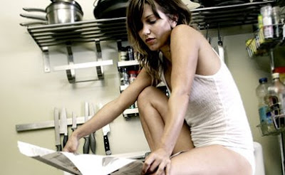
Okay, so I have a shoot coming up that is right up your alley! And it will involve a lot of learning on my part to pull it off. My friend (we'll call her "Her" as I haven't asked permission to talk about it) wants to submit pictures to Suicide Girls. I've known about the site for ages but had never delved into the content before. I figured I'd better brush up so that I'll have a better chance of getting Her the results she wants.
I've discovered a couple things, the main being that the Girls don't just submit random sexy photos; they put thought into a theme that holds the whole set together. While I have not yet looked through a full set (it costs monies to join!), I pored over about 16 pages of set preview thumbnails and got the gist on common themes:
colors (soft pink, indigo, black bed, against red)
music videos (fiona apple's criminal, MJ's thriller)
or, more broadly, pop culture references
(kiss army, the force, alphabet aerobics)
sexy-fying otherwise innocent scenarios
(making dinner, reading the paper, going fishing)
the "gritty" stuff (violence, decay, the devil, etc)
showcasing a hobby (polaroid photos, classic cars, deejaying)
showcasing a lifestyle (veganism, lesbianism)
embracing a body part/region (belly, faces)
evoking a feeling
(unleashed, soft touches, sunkissed, warning: may cause injury)
illustrating euphemisms/dirty phrases
(pearl necklace--but with an actual necklace)
and lastly, the ones that disappoint me...
lacking creativity/washed up themes
(back to school, hot tub/swimming pool/shower)
So, I'm thinking my plan of action is 1) think of any situation, then 2) consider ways to make it sexy and 3) plan a storyboard of sorts to build suspense/a story. Any ideas? In the meantime, some examples:
Scout's Sunday Times:

and Mary's humorous Gossip Girls:

4.22.2009
4.01.2009
andy rides bmx
 yessir, yessir.
I'm stoked on this picture -- it's from the first time I've taken pictures of Andy riding, which was last Friday (right before we enjoyed margaritas & yummy food at Acapulco! mmmmmm).
OK, so before you read any further--do me a favor! Look at this image and think about how Andy got way up there in the air. What happened before this moment? What happened after? Where did he come from, where did he go? Where did you come from Cotton-Eye Joe?
Did you think about it? Maybe write it down? Thanks!
The biggest reason I like this picture is because Andy was happy with it. I'm having trouble figuring out what elements make a bmx photo a good one. Like what information does a rider gather from an image that makes them think a trick looks sick or not?
I have been asking this question for a while and I learned a bit about it on Friday. Once I started shooting and asking questions and observing it wasn't so hard. (I think dating Andy for a long-ass time helps, too--seeing as riding is not so foreign to me anymore. but anyways!)
To answer the question "How did Andy get way up there in the air?": In this instance, he was doing a 270 table. Meaning he spun around 270 degrees and pulled his bike parallel to the ground like a table. (You might even call this one an invert but we won't get into that.)
He started by coming up that lower ramp in the front:
 Did you guess that correctly?
Next he spun counter-clockwise while doing that table-y thing:

Then he finished it off going down the larger ramp on the right:

All together now!

...maybe we need to get some video up in this shit... heehee
How close did you come to guessing his actions correctly? I ask because I am pretty damn sure that no one who read this rides bmx, and I know that when I look at a bmx photo, I'm like "How the hell did that happen?" Even though I watch videos and hang out with those scumbags while they ride, I still don't know. So I'm curious. And excited to learn more by shooting! So Andy better get another trick up his sleeve soon.
Subscribe to:
Comments (Atom)


